Design Direction for a NYC Nursery
Over the weekend I shared exciting news that my husband and I are expecting a baby girl this December! Early this summer, I paused all work on our A-frame to focus on getting our new apartment in Tribeca set up - not an easy feat with the lead times plaguing the industry currently! Most importantly, I’ve been working on the nursery concept and wanted to share that process on here as well!
Approach
Whenever I approach a project, I focus on two primary questions:
What does this space want to be?
What are the client’s needs and tastes?
I did the same for this space. Asking yourself ‘What does this space want to be’ helps ensure that you work with what you have not against it. The design has to make sense in the greater context. For this project, the raw space is a bright white, airy space with floor to ceiling windows in a Tribeca high-rise. With the space being modern, clean and almost gallery-like with a backdrop of the skyline, I wanted to keep the space in that same vain.

The raw space.
‘What are the client’s needs and tastes’ is often a more challenging question to answer. For this project there are clear functional needs:
Crib
Dresser/Changing Table
Rocking Chair/Glider
Pull-out Sofa (we’ll need this space to double as a guest room from time to time!)
Toy and Book Storage
Soft Floor Surface for Playing
Then there are aesthetic needs and tastes… As the client myself, I want this space to feel creative, artistic, and fun but still sophisticated and modern in line with the rest of the apartment and the city itself. For me, a ‘theme’ is not what I am after here. I am looking at textures - fun textures for a baby to touch and feel - and an intriguing color palette - something that inspires playfulness.
Inspiration

Around the time I found out I was having a girl, the Zimmermann Resort 2022 show went live with the most stunning set design. It felt so clean, fresh and modern but still had a playfulness to it with the vibrant ombre color backdrop. I also loved the way the highly textural and intricately woven pieces added a layer of femininity and interest atop the visual foundation of the set. This became my sole inspiration around which I’ll plan the palette, select textures and furniture.
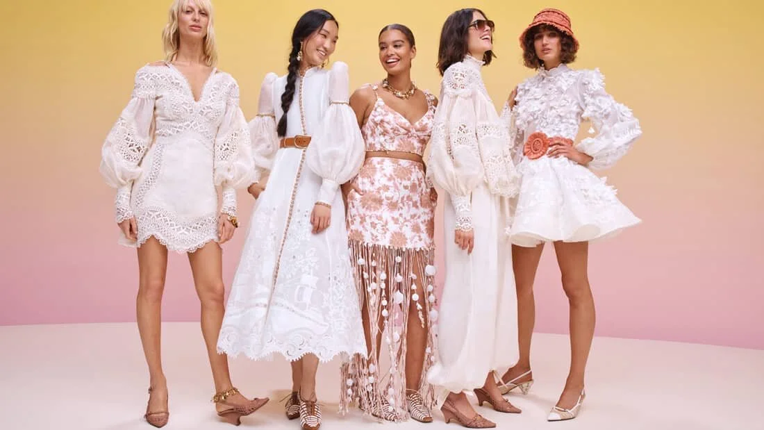


When designing a space, it’s easy to get caught up in looking solely at other interiors for reference imagery. I do it myself all the time! That being said, it is great to look outside of interiors - you avoid somewhat ‘copying’ other designs and it often sparks a more creative or interesting staring point that you can then translate into a physical space. I love referencing fashion and set design because so many of the ideas, layers and details lend themselves to reinterpretation in an architectural setting.
Check back for more on how we translate this inspiration to the foundational design elements (walls and floors) and layer in furniture, texture and lighting. More to come this week!